
DUOLINGO ENGLISH TEST · PRODUCT DESIGN
Turning high-stakes test guidance into clear next steps
Turning high-stakes test guidance into clear next steps
Turning high-stakes test guidance into clear next steps
I redesigned Test Info around four clear destinations, helping test takers find critical guidance without digging through dense pages.
I redesigned Test Info around four clear destinations, helping test takers find critical guidance without digging through dense pages.
ROLE
Sole product designer · UX/UI, information architecture, and prototyping
TEAM
PM, user researcher, Security, and Customer Service
CONTEXT
Part of a broader Duolingo English Test product revamp
CONTEXT
Part of a broader Duolingo English Test product revamp
THE CHALLENGE
Critical guidance was hard to find and hard to absorb
Critical guidance was hard to find and hard to absorb
Critical guidance was hard to find and hard to absorb
Test takers needed to understand the test, prepare correctly, and follow its rules. Dense content and unclear navigation made both difficult.
Test takers needed to understand the test, prepare correctly, and follow its rules. Dense content and unclear navigation made both difficult.
01
Too much to read
Too much to read
The official guide ran to 77 pages, and dense screens overwhelmed people before they began.
The official guide ran to 77 pages, and dense screens overwhelmed people before they began.
02
The wrong choices stood out
The wrong choices stood out
The hub emphasized destinations that did not match what test takers needed most.
The hub emphasized destinations that did not match what test takers needed most.

01 · CONTENT
Decide what mattered before redesigning
Decide what mattered before redesigning
Decide what mattered before redesigning
I mapped content to the test-taker journey, then aligned partners on what belonged at each stage.
I mapped content to the test-taker journey, then aligned partners on what belonged at each stage.
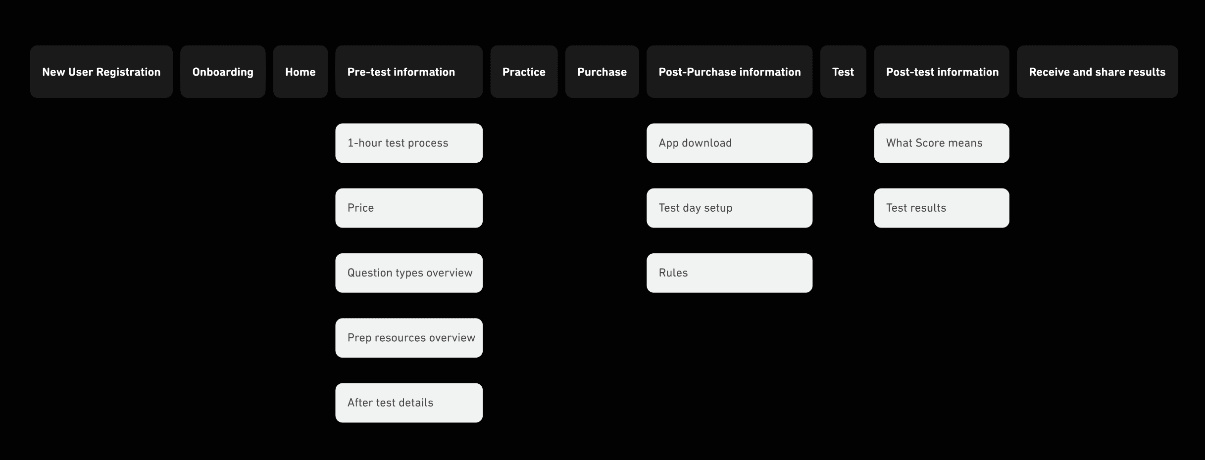
Testing showed the Scoring concept was still too dense, so I cut confusing tips and kept what clarified the experience.
Testing showed the Scoring concept was still too dense, so I cut confusing tips and kept what clarified the experience.

02 · READING EXPERIENCE
Short, scannable pages beat a guided flow
Short, scannable pages beat a guided flow
Short, scannable pages beat a guided flow
Mapping the concept against real edge cases showed that the interaction added complexity without improving clarity.
Mapping the concept against real edge cases showed that the interaction added complexity without improving clarity.
03 · NAVIGATION
Keep four clear destinations visible
Keep four clear destinations visible
Keep four clear destinations visible
Once the content was in the right place, personalization and sequencing added unnecessary logic. I kept all four destinations visible and fit Test Info into the broader navigation.
Once the content was in the right place, personalization and sequencing added unnecessary logic. I kept all four destinations visible and fit Test Info into the broader navigation.
01
Test process
Test process
02
Rules
Rules
03
Test-day setup
Test-day setup
04
Understanding scores
04
Understanding scores

OUTCOME
More people found the information they needed
More people found the information they needed
More people found the information they needed
1,113 → 161
1,113 → 161
1,113 → 161
words on a redesigned page
+25%
+25%
+25%
Test Info visits
+685%
+685%
+685%
Rules page views
+500%
+500%
+500%
Scoring page views
REFLECTION
What I took forward
What I took forward
What I took forward
Adapt patterns to the product
Adapt patterns to the product
Duolingo’s mobile-first patterns needed to work just as clearly on desktop.
Duolingo’s mobile-first patterns needed to work just as clearly on desktop.
Make alignment concrete
Detailed and visual artifacts helped different teams review the same decision.
Make alignment concrete
Detailed and visual artifacts helped different teams review the same decision.
More case studies